
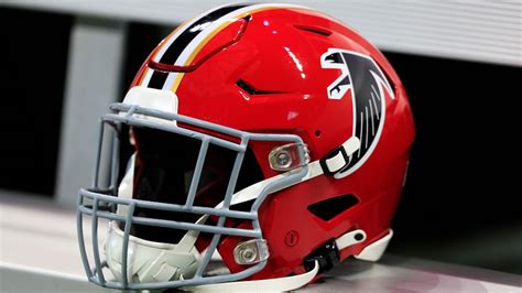
The Atlanta Falcons officially unveiled their refreshed team identity today, though the announcement itself drew immediate comparisons to internet culture and linguistic quirks. The new visual—which the team’s X account described as a “Profile Picture” (PFP) update—has generated widespread discussion for its distinctive design elements.
A side-by-side comparison shows the original logo on the left, with the refreshed iteration positioned on the right. Many observers have noted an unexpected “Germanic” aesthetic in the new emblem, prompting playful speculation about its origins and intent.
The reaction on social platforms has been particularly spirited, with users frequently referencing a classic Norm MacDonald comedy bit about confusing acronyms: “I” stands for itself, while “D” is short for “Dentification.” This linguistic twist resonated strongly in the comments section, where the Falcons’ logo change became a running joke among fans.
The team’s decision to pivot toward this updated visual language has been met with both curiosity and humor, highlighting how modern branding choices often intersect unexpectedly with internet culture—and sometimes, even vintage comedy routines.